Illustration in product design serves as a visual storytelling output, and also a practice and process to unleash deeper exploration and understanding of the product experience.
Illustration as an output, process, and practice.
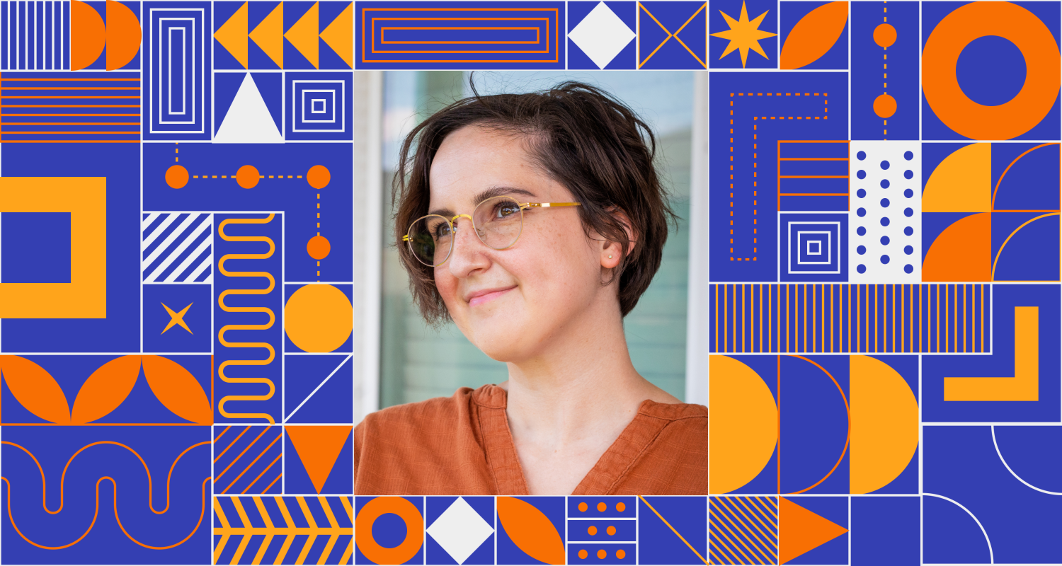
As a kid, Laura Cole drew to make sense of the world. “I needed to draw things to help me remember concepts,” she says. In college, she considered a career as an illustrator before turning her focus to interaction design after receiving a Bachelor of Fine Arts at The University of Texas at Austin. Today, as a Duo Security Senior Product Designer, she uses her illustration talents to help to simplify complex ideas during the design process in ways she never expected.
About a year ago, she was struggling to understand a new product called “Session Trust Analysis” that uses Duo Device Health data to evaluate user security on an ongoing basis. If Duo detects a problem, the user may be asked to fix something and/or authenticate into the application again. This helps protect users and the resources they are accessing throughout their session, not just at the time of authentication. These automatic decisions act as an intelligent first line of defense. They also serve to reduce blind spots for IT administrators and analysts." To design a seamless UX experience, Laura needed a deeper-than-surface understanding of Session Trust Analysis.
“I had trouble pinning down certain parts of the product and how it all worked,” she says. “I realized I was getting stuck in the Figma files—that tool was becoming a limiter, not an enabler for creativity, so I just pulled out my iPad and started to sketch. I started blocking off time every day on my calendar to sketch.”
It wasn’t just open time but a focused daily practice that she called “Crazy 8s” because she challenged herself to draw eight one-minute sketches. Here is one of her early sketches as well as her notes for her daily Crazy 8s assignment.
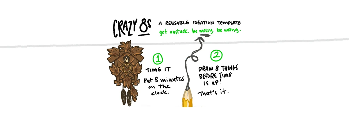
“One of my early sketches was an unnecessarily detailed cuckoo clock,” she says. “My grandparents had one when I was growing up. I made this and other drawings more for myself. It was for a self-designed template. It didn't have to be that detailed, but it made me more excited to dive into the creative process. I would pick a topic and move from very detailed sketches to showing larger concepts. Eventually the process helped me to make sense of complex security concepts at work. People started noticing, and I was asked to help visualize understanding for us as a group. The rest is history!”
That “history” is a highly visible role as an illustrator alongside her more traditional UX design skills. From creating illustrations to help inform meaningful context, mental models, journey maps and wire-flows to improving shared understanding across teams and stakeholders, her sketching is no longer a hobby but a valued skill. “My manager kept telling me to find the process that brings me joy,” she says. “That’s exactly what I’ve found bringing more visual storytelling to my work.”
Below, we feature an article and illustrations Laura created for an internal newsletter, “Design in Depth.” You can see examples of how her illustrations help communicate mental models and customer journeys for Duo Session Trust Analysis.
I always viewed illustration as a separate hobby from the world of Figma and mockups. Last year, when I started to incorporate the two, I realized how helpful it can be, not only for me but for the team members I work with as well. Illustration is my superpower. It has allowed me to be a better problem solver, connector, and educator. It's also allowed me to find more joy in my own work every day. Early sketches helped me confirm my understanding with stakeholders and launch discussion. And soon, I began to move from sketch to illustration. Formalizing these drawings helped clarify the concepts I was trying to get across. It also made me and others more excited about and in tune with the work. I've included some recent examples below.
Session Trust Analysis
Our team had just formed and we were all trying to grasp what “Session Trust” really meant. Shayne, an engineer on our team, informally adapted a Duo blog post ("The Beer Drinker's Guide to SAML") to explain the mental model over Slack. Wristbands and drinks at a festival or concert became stand-ins for user access. Inspired and looking to confirm my understanding, I created this illustration. It added clarity and a bit of fun to something we were all trying to understand. It also became an artifact I could leverage to share this understanding with other teams.

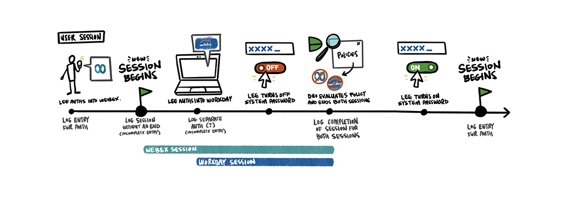
User Session Journey Map
This user journey map resulted from a recurring, cross-team (and cross-functional) brainstorm. Andrea, a designer on Policy, and Shayne, an engineer on our team, and I put our heads together to break down sessions. I sketched in our shared Miro board, while my team members created tables and flows. It was a great, tangible representation of how all our brains worked. From these sessions, I created, refined, and finalized this session journey map. It's been a great way to quickly and easily explain how our MVP would work during customer calls.
